AM King company logo

Key-Challenges

AM KING grappled with a website burdened by an abundance of pages and scattered information, creating a navigational nightmare for users. Beyond restructuring navigation, we addressed the absence of a typographic key, palette, and graphic structure. The overall style felt congested, and the lack of cohesive content prevented users from following a clear and engaging story.

THE BEFORE

Your partner in building a sustainable mining future.
Original AM King website layout with construction equipment details.

The Solutions

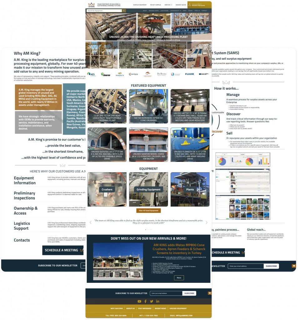
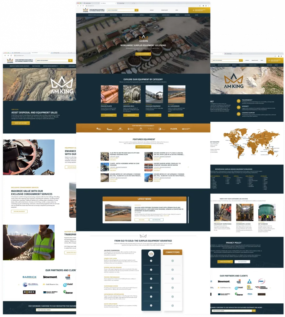
To tackle the navigational nightmare, we streamlined the website’s architecture, decluttered excessive pages, and introduced a clear typographic key. Recognizing the need for a cohesive visual identity, we crafted a distinct palette and graphic structure, transforming the congested style into a visually harmonious experience. Additionally, we worked closely with AM KING to develop engaging content that tells a compelling story. The result is an optimized website that not only simplifies navigation but also boasts a unified design language and a narrative structure, providing users with a more enjoyable and coherent journey.

THE AFTER

Your partner in building a sustainable mining future.
Showcase of AM King’s redesigned website with company insights.